

Nike SB
Campaign Triptych
Photoshop • Procreate • 2025
Originally developed as a poster campaign for a Nike SB shoe drop, this project explores how bold graphics, texture, and movement can scale across a launch system. The triptych pulls from skate culture’s raw, street-level energy, combining collage, photography, and bold type to create visuals that feel loud, fast, and grounded in real environments.
Set The Mood
This mood board pulls from real street skating: worn concrete, rough asphalt, low-angle trick shots, and lived-in Nike SB footwear. The textures and surfaces set a raw, grounded tone built around movement, impact, and everyday skate spots.
Sketch Phase
The early sketches explored composition, hierarchy, and how to combine photography with collage textures and bold type. Each sketch helped define the rhythm and structure that carried into the final posters.
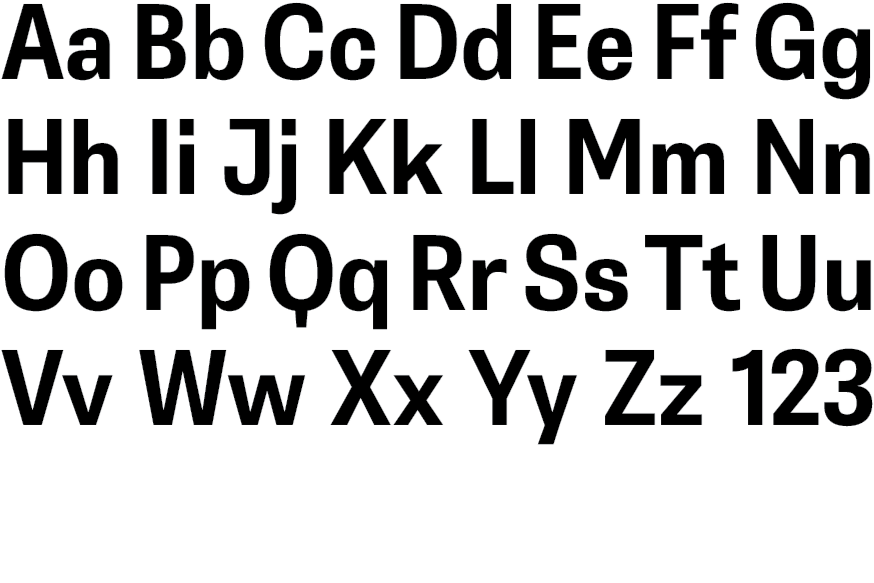
Typeface Selection
Belarius Sans Bold
Previous Options
Futura Bold, Acier BAT
Typeface Study
Rather than leaning into Nike’s usual Futura-driven look, this typeface brings a thicker, more grounded weight that fits the raw, DIY tone of Nike SB. Its bold, compact geometry delivers a strong, direct message while still letting the textures, neon accents, and photography take the lead.
Color Selection
Volt Green, Hyper Pink, Concrete Gray, True Black
Color Study
The color palette uses a mix of neon accents and deep neutrals to reflect the fast, raw feel of skateboarding culture. The neon tones add attitude and impact, while the darker grays ground everything in a real street environment.
Volt Green
HEX #C3FA39
RGB 195, 250, 57
CMYK 22, 0, 77, 2
Concrete Gray
HEX #2E2E2E
RGB 46, 46, 46
CMYK 0, 0, 0, 82
First Drafts
Hyper Pink
HEX #F9387E
RGB 249, 56, 126
CMYK 0, 78, 31, 2
True Black
HEX #000000
RGB 0, 0, 0
CMYK 0, 0, 0, 100
The first drafts tested lighting, contrast, texture balance, and placement before simplifying the final compositions. These early versions helped establish hierarchy and refine the flow of each poster.
Final Designs
The final triptych brings all adjustments together into one unified system. Each piece feels balanced, loud, and cohesive while still having its own identity within the campaign.