

Philip Macchi Design
Brand Identity
Photoshop • Procreate • 2025
My identity centers on a bold handwritten PM monogram that reflects my lettering background and fast expressive style. I wanted a mark that feels personal, energetic, and recognizable across print, motion, and branding work.
Sketch Phase
I explored a wide range of structures including serif blocks, circular lockups, extended forms, script variations, and graffiti-influenced strokes. These sketches helped me develop the movement, rhythm, and personality of the monogram.
Typeface Selection
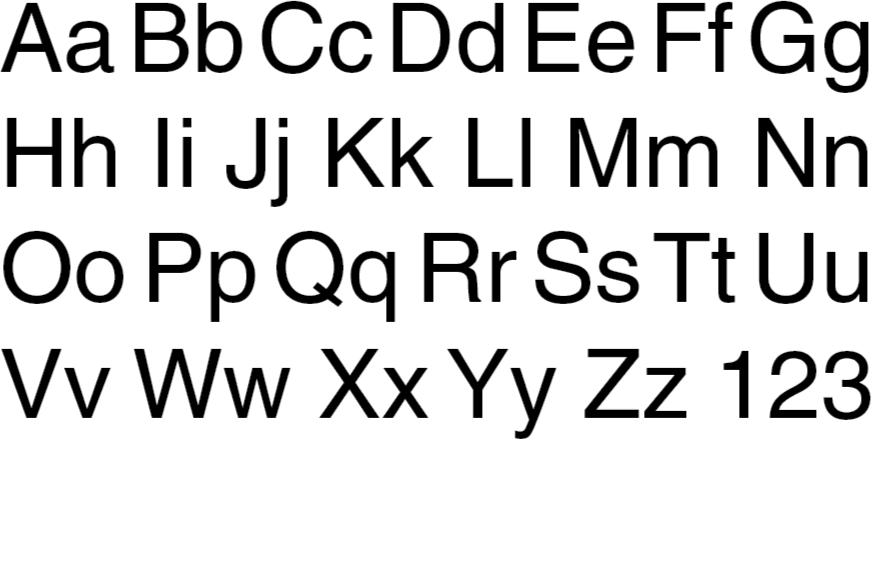
Helvetica LT Pro Roman
Previous Options
Source Sans Pro, Broadarce
Typeface Study
Helvetica LT Pro Roman was chosen for its clean proportions and neutral tone. The simplicity of the letterforms keeps the layout clear and allows the expressive logo to stay at the center of the system.
Color Selection
Royal Amethyst, Near Black, White
Color Study
The palette uses royal amethyst, near black, and white to create a clean and flexible foundation for the identity. Royal amethyst brings character and individuality, near black adds weight and structure, and white opens the layout and keeps everything readable. Together they create a simple but confident palette that supports the expressive hand-drawn logo.
Royal Amethyst
HEX #7B57A4
RGB 123, 87, 164
CMYK 58, 69, 0, 0
Near Black
HEX #0C0C0C
RGB 12, 12, 12
CMYK 0, 0, 0, 95
White
HEX #FFFFFF
RGB 255, 255, 255
CMYK 0, 0, 0, 0
First Drafts
My first digital drafts tested block logos, monograms, and handwritten marks to see what matched my style best. Seeing them side by side made it clear that the hand-drawn direction had the strongest personality and felt the most authentic to my work. These drafts helped narrow the focus before moving into final refinement.
Refinement
I first tried a bright yellow circle, but it didn’t fit my brand. Switching to a purple tone made the hand-drawn mark stand out, and a clean white outline kept the lettering from looking flat. I also moved from Source Sans Pro to Helvetica LT Pro Roman for the supporting text. Throughout this stage, I tested different placements, scale, spacing, and color until the logo and type felt balanced, professional, and still true to the energy of the hand-drawn mark.
Final Design
I locked in the final shade of purple after testing multiple variations and chose the version that felt bold without being overwhelming. I also softened the black so the logo reads cleaner at smaller sizes. The final stroke was refined into a simple white shape that helps the mark pop and keeps the lettering from blending into the background. I finalized the placement of the type by building everything on a grid and aligning the elements for consistency. The finished logo brings together the hand drawn character of my PM lettering with a clean, modern structure that works across my brand.