

Dead Heat Streetwear
Brand Identity Package
Photoshop • Procreate • Illustrator • 2026
Dead Heat Co. is a fully realized streetwear brand built to show a complete brand identity system from concept to campaign. Starting from a name and a feeling the project grew into a logo system, multiple apparel collections, and a full desert campaign. Everything from the mark to the mockups was designed to feel like a real brand ready to drop.
Set the Mood
Dead Heat lives in the American Southwest. Scorched desert highways, blazing sun, cracked earth, and dry heat that hits you before you even step outside. The visual world pulls from that environment and pushes it somewhere darker and more surreal. Two suns on the horizon, one real and one not. The brand exists somewhere between a road trip and a fever dream.
The mood board combines imagery tied to extreme heat, environmental pressure, and exhaustion alongside references from established streetwear brands in a similar space. Images of melting ice were included to represent the opposite of heat, breaking down and collapsing under extreme temperature, reinforcing the idea behind the name “Dead Heat.” Together, the visuals create a world that feels sun-faded, intense, worn down, and pushed past its limit.
Sketch Phase
The process started with a full sheet of logo concepts exploring different directions for the brand mark before landing on the rising sun skull as the primary icon and the crosshair skull as the secondary mark. From there the apparel graphics were sketched out across two distinct collection directions before moving into digital production.
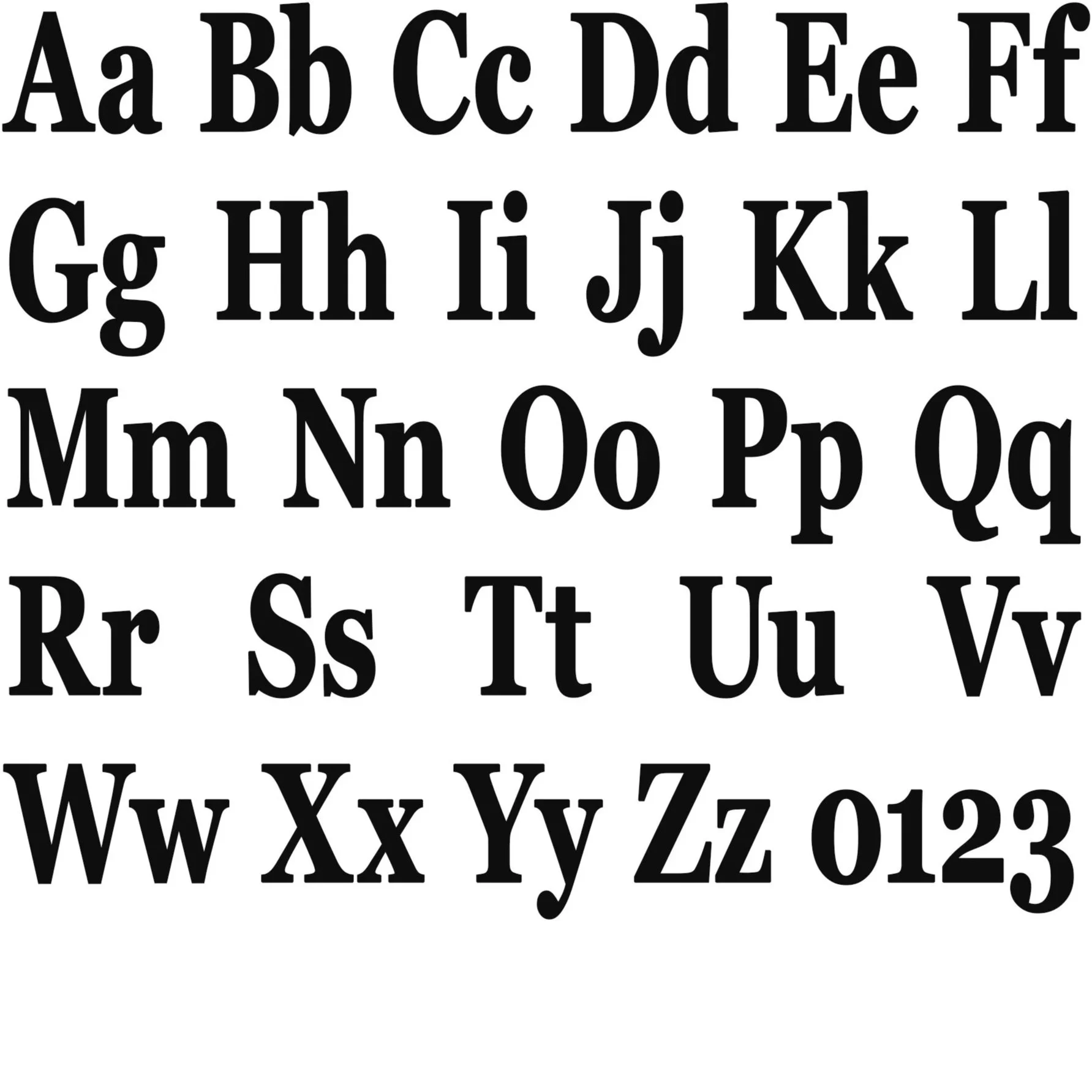
Typeface Selection
Typeface Selection Georgia Pro Bold
Previous Options Freight Display Pro, Neue Haas Grotesk
Typeface Study Georgia Pro Bold brought the right amount of weight and history to the brand without feeling overdone. The bold serif structure gives Dead Heat a sense of authority that works across everything from the wordmark to campaign type without ever feeling like it is trying too hard.
Color Selection
Dead Black, Bone White, Sun Gold, Asphalt Red
Color Study Black is the foundation everything lives on. White keeps the brand mark clean and readable at any distance. Sun gold ties back to the desert heat at the core of the brand identity. Asphalt red brings aggression and energy to the street series graphics.
Dead Black
HEX 0D0D0D
RGB 13, 13, 13
CMYK 0, 0, 0, 95
Bone White
HEX F2F0EB
RGB 242, 240, 235
CMYK 0, 1, 3, 5
Sun Gold
HEX D4A017
RGB 212, 160, 23
CMYK 0, 25, 89, 17
Asphalt Red
HEX C0392B
RGB 192, 57, 43
CMYK 0, 70, 78, 25
Final Designs
Dead Heat Co. was built as a complete brand from the ground up. The identity system, the apparel, the campaign, and the visual world all came from the same place and speak the same language. The logo marks work across every touchpoint from embroidered hats to billboard scale. The two apparel collections show range within a single brand voice. And the desert campaign ties everything together into something that feels like a real label with a real world behind it rather than just a set of graphics on a shirt.